CSS3 Gradients: No Image Aqua Button
Note (Jan 28, 2010): I added a Firefox support to this tutorial. Please visit the “revisited” article too!
Boooo, Yahoo! just had the 3rd round of layoff within a little over a year period, and this time I was axed with several more fellow excellent engineers of Mobile team. So now I have free time to spend on more coding!
My job function needed full focus on products and it prevented me to have experiments and testing as I wanted to, so I always spent my own time to do. Now I can do whatever I want to while I am still on payroll. Yes! I am still paid my regular salary for a while, thanks for the new regulation

OK, enough blah about the stupid corporate stuff.
Anyway, I played around with WebKit CSS3 gradient and created a useless but fun stuff – an Aqua button with no images!
Back in the time when Mac OS X was first announced, there’re a plenty of web tutorials that describe how to create the sexy aqua button with Photoshop, and now I can show how to create one with CSS!
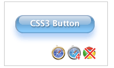
Here’s a screen capture of the rendered button. You can see the actual HTML page too.
OK, let’s take a look at the code:
<div class="button aqua">
<div class="glare"></div>
Button Label
</div>
Create a Button Base and Styling Label
.button{
width: 120px;
height: 24px;
padding: 5px 16px 3px;
-webkit-border-radius: 16px;
-moz-border-radius: 16px;
border: 2px solid #ccc;
position: relative;
/* Label */
font-family: Lucida Sans, Helvetica, sans-serif;
font-weight: 800;
color: #fff;
text-shadow: rgba(10, 10, 10, 0.5) 1px 2px 2px;
text-align: center;
vertical-align: middle;
white-space: nowrap;
text-overflow: ellipsis;
overflow: hidden;
}
The first part to render a rounded-corner rectangle. Set the position as relative to place “glare” inside of the button later.
The second part is for styling the label.
Give text-shodow with alpha-transparency. (Believe or not, Chrome and Android do not support text-shadow!)
Button Color and Shadow
.aqua{
background-color: rgba(60, 132, 198, 0.8);
background-image: -webkit-gradient(linear, 0% 0%, 0% 90%, from(rgba(28, 91, 155, 0.8)), to(rgba(108, 191, 255, .9)));
border-top-color: #8ba2c1;
border-right-color: #5890bf;
border-bottom-color: #4f93ca;
border-left-color: #768fa5;
-webkit-box-shadow: rgba(66, 140, 240, 0.5) 0px 10px 16px;
-moz-box-shadow: rgba(66, 140, 240, 0.5) 0px 10px 16px; /* FF 3.5+ */
}
Now, specify the appearance of the button and shadow at bottom.
Here. I use the -webkit-gradient to create a nice-looking aqua gradient.
Notice that I use -webkit-gradient as a background-image, although there’s no physical graphics are added there.
You can use gradients in background-image, border-image, list-style-image and content property.
On Firefox, this is ignored and you see only Background-color.
The syntax for linear gradient is as follows:
-webkit-gradient(lenear, left top, right bottom, from(start color/alpha), to(end color/alpha))
In this example, starts with dark blue from straight top to bottom (no angle) at 95%, not all way down, to blended into lighter blue.
Then, I specified color on each border (so the css looks pretty messy).
Finally, give a nice shadow at bottom, with -webkit-box-shadow.
Firefox 3.5+ supports it too, so duplicate it with -moz-box-shadow.
Syntax is as:
[color/alpha] [horizontal offset] [vertical offset] [blur radius]
Give it shine
.button .glare {
position: absolute;
top: 0;
left: 5px;
-webkit-border-radius: 8px;
-moz-border-radius: 8px;
height: 1px;
width: 142px;
padding: 8px 0;
background-color: rgba(255, 255, 255, 0.25);
background-image: -webkit-gradient(linear, 0% 0%, 0% 95%, from(rgba(255, 255, 255, 0.7)), to(rgba(255, 255, 255, 0)));
}
The class glare renders the glossy look on the button.
First, give absolute position to the parent container, button to give shine in the right position.
<;li
Again, use -webkit-gradient to create the glossy look, by playing with alpha-transparency.
Start with the white (alpha 0.7) and end with complete transparent (alpha 0).
Honestly, I do not like to have this non-semantic empty div block to only get this visual effect.
I need to figure a better way to do.
References:
Short story: keeping my website since 1996, finally started this blog in 2007.
Long story: see "


June 20th, 2009 at 10:12 am
Great work!
Do you plan to make it more “buttonish”, with hover transitions?
June 20th, 2009 at 11:13 am
Thanks Ron!
In fact, I was playing around with hover by changing text color/shadow etc. just I didn’t bother adding to this blog too much extras!
Changing position slightly on click event can be another possibility!
July 29th, 2009 at 3:35 pm
Tried it in the dev build of Chromium on Ubuntu Jaunty 64-bit (v3.0.196.0 (0)) and it works !!!!
It needs a bit of anti-aliasing, but god-damn, it’s there
Nice work my man !!!!
August 17th, 2009 at 8:30 am
It works perfectly on the iPhone Safari in OS 3.0.
August 17th, 2009 at 10:47 am
Looks like browsers’ css-support has been getting better since I did this test! I need to test on current browsers! BTW, when I tested on Palm Pre emulator, this didn’t work at all.
September 2nd, 2009 at 1:59 pm
It works in the Firefox/3.5.2 too! I’m really glad that Safari/WebKit is leading the way in making CSS3 more useful.
I was wondering what your copying policy is on this code…
I’m working on a WordPress theme to replace my clunky old one
Thanks for the tutorial.
September 2nd, 2009 at 2:08 pm
Works on the latest FF? Awesome! When I wrote his and tested, it looked really bad on FF.
Regarding copy policy, this is considered to be a public domain so I have no issue, but if you are talking about this WordPress theme CSS code, I used an existing theme and modified. The author of the original theme likes this makeover!
September 7th, 2009 at 2:50 pm
Amazing tut! Cannot wait to use this technique in some web designs!
September 28th, 2009 at 12:42 am
it’s amazing yar!!!!!! i m impressed
November 5th, 2009 at 3:05 pm
Very similar appearance can be achieved with multiple inset box shadows in firefox.
http://markusstange.wordpress.com/2009/02/15/fun-with-box-shadows/
Before my Wordpress got hacked(for the 3rd time) I was about to post a list of things in Adobe Illustrator that I wish they’d add to CSS3.
Turns out #1 on my list is also achievable with multiple box shadows.
http://weston.ruter.net/2009/06/15/multiple-borders-via-css-box-shadow/
November 8th, 2009 at 1:05 am
works on FF 3.55 just fine. cool! too bad IE does gradients differently from webkit.
November 8th, 2009 at 1:13 am
If you add cursor:pointer; to a hover selector, that will give it a hand cursor so it looks like you can click it.
November 11th, 2009 at 1:40 am
never mind – you are right – ff3.55 has no gradient support. and ff doesn’t work for doing firmware uploads to my router either. must use google chrome.
November 17th, 2009 at 4:39 pm
Chrome looks the same as safari 4 and webkit now… i bet you tried this on an older version of chrome, and if you try now it’ll work!
December 7th, 2009 at 3:43 pm
Agreed with Todd, I feel like this looks best on Chrome, especially since they started smoothing their rounded corners. I am on the dev channel release though…
December 7th, 2009 at 10:59 pm
Thanks guys for reports on other/newer browsers especially Chrome!!! I need to catch up you all.
Firefox now supports gradient but seems like Moz guys have done differently so I don’t thin switching -webkit to -moz would work.
If you’d like to try, there’s a tutorial at:
http://hacks.mozilla.org/2009/11/building-beautiful-buttons-with-css-gradients/
December 14th, 2009 at 11:33 am
And, along with all the other reports above, I can state that you get everything except the dropshadow on the Palm Pre built-in browser which is based on webkit. It’s very slick, makes me want to get rid of the images for buttons on the website I’m rebuilding now and just let the IE users suffer in their squareness.
December 19th, 2009 at 7:41 pm
Apparently Webkit supports multiple backgrounds. I haven’t tried it, but it might work for what you’re trying to achieve.
December 30th, 2009 at 11:52 am
It works with the latest Chrome beta just fine by the way…
January 18th, 2010 at 6:33 am
[...] CSS3 Gradients: No Image Aqua Button [...]
January 22nd, 2010 at 5:08 am
You should update your example for FF3.6 now that it’s out, it looks pretty much exactly like the webkit sample, the syntax is slightly different though
.button .glare {
-moz-linear-gradient(rgba(255, 255, 255, 0.7) 0%, rgba(255, 255, 255, 0) 95%);
}
etc
January 22nd, 2010 at 11:16 am
Yeah you’re right Mark!
I’ve been aware of the mozilla version of gradient implement but I haven’t taken care of my blog! I shuould!!!
January 25th, 2010 at 12:31 am
This looks very very very creative.
What about IE? Till now, more than 50% users use IE. Is there any way to get the same effect?
Thank you so much.
January 28th, 2010 at 3:17 pm
[...] is an update for the Aqua button tutorial. This update will add a support for Firefox 3.6. If you haven’t seen the article, please go [...]
February 1st, 2010 at 10:07 am
Visual results are incredible but semantics use needs attention for correct use of button hypertext tag. Congratulations.
February 1st, 2010 at 11:23 am
so true! using
February 1st, 2010 at 4:03 pm
[...] CSS3 Gradients: No Image Aqua ButtonI played around with WebKit CSS3 gradient and created a useless but fun stuff – an Aqua button with no images! Back in the time when Mac OS X was first announced, there’re a plenty of web tutorials that describe how to create the sexy aqua button with Photoshop, and now I can show how to create one with CSS! [...]
February 1st, 2010 at 8:44 pm
[...] (Codes from GirlieMac) [...]
February 2nd, 2010 at 4:25 am
[...] CSS3 Gradients: No Image Aqua ButtonI played around with WebKit CSS3 gradient and created a useless but fun stuff – an Aqua button with no images! Back in the time when Mac OS X was first announced, there’re a plenty of web tutorials that describe how to create the sexy aqua button with Photoshop, and now I can show how to create one with CSS! [...]
February 3rd, 2010 at 8:02 pm
[...] CSS3 Gradients: No Image Aqua ButtonI played around with WebKit CSS3 gradient and created a useless but fun stuff – an Aqua button with no images! Back in the time when Mac OS X was first announced, there’re a plenty of web tutorials that describe how to create the sexy aqua button with Photoshop, and now I can show how to create one with CSS! [...]
February 4th, 2010 at 11:22 pm
[...] CSS3 Gradients: No Image Aqua Button [...]
February 8th, 2010 at 8:15 pm
[...] CSS3 Gradients: No Image Aqua ButtonI played around with WebKit CSS3 gradient and created a useless but fun stuff – an Aqua button with no images! Back in the time when Mac OS X was first announced, there’re a plenty of web tutorials that describe how to create the sexy aqua button with Photoshop, and now I can show how to create one with CSS! [...]
February 10th, 2010 at 12:54 pm
[...] CSS3 Gradients: No Image Aqua Button I played around with WebKit CSS3 gradient and created a useless but fun stuff – an Aqua button with no images! Back in the time when Mac OS X was first announced, there’re a plenty of web tutorials that describe how to create the sexy aqua button with Photoshop, and now I can show how to create one with CSS! [...]
February 16th, 2010 at 4:47 am
[...] CSS3 Gradients: No Image Aqua Button [...]
February 20th, 2010 at 5:45 am
I’d like to correct Mark’s post above:
“You should update your example for FF3.6 now that it’s out, it looks pretty much exactly like the webkit sample, the syntax is slightly different though
.button .glare {
-moz-linear-gradient(rgba(255, 255, 255, 0.7) 0%, rgba(255, 255, 255, 0) 95%);
}
etc”
The correct code would be:
.button .glare {
background-image: -moz-linear-gradient(rgba(255, 255, 255, 0.7) 0%, rgba(255, 255, 255, 0) 95%);
}
February 20th, 2010 at 9:29 am
Great trick, thanks.
February 22nd, 2010 at 8:10 am
[...] CSS3 Gradients: No Image Aqua Button [...]
March 12th, 2010 at 12:38 am
It rocks !!
I love it.
March 12th, 2010 at 10:17 am
[...] CSS3 Gradients: No Image Aqua Button [...]
April 8th, 2010 at 11:23 am
[...] a coverflow effect on your menus or navigation using only CSS3 transition elements and properties.Aqua Buttons – Create no image aqua-like buttons with pure CSS3 elements. Works best in Safari Web browser for [...]
April 9th, 2010 at 12:21 pm
Heyho,
thanks for the nice idea. Nevertheless there is a problem with the very light bg color, which is the top “glare” of the button: in case a browser doesn’t understand -moz-box-shadow, the light color makes the text nearly impossible to read. So my suggestion is to define a darker bg color and use a last layer with shadows grown so large that nothing of the bg remains:
add this as last shadow to your -moz-box-shadow:
inset 0 0 0 100px rgba(205, 222, 238, 1);
Jörn
April 9th, 2010 at 12:26 pm
s/light/bright/
May 7th, 2010 at 1:31 pm
Hey, I’m just about to quote your article on my website and I thought I would check if its ok? I’ll put a linkback as well!
May 7th, 2010 at 2:13 pm
yeah sure, markus
May 24th, 2010 at 11:10 pm
[...] CSS3 Gradients: No Image Aqua Button [...]
May 29th, 2010 at 7:55 am
[...] CSS3 Gradients: No Image Aqua Button I played around with WebKit CSS3 gradient and created a useless but fun stuff – an Aqua button with no images! Back in the time when Mac OS X was first announced, there’re a plenty of web tutorials that describe how to create the sexy aqua button with Photoshop, and now I can show how to create one with CSS! [...]
May 31st, 2010 at 9:42 am
[...] CSS3 Gradients: No Image Aqua Button [...]
June 17th, 2010 at 7:48 am
[...] Aqua Buttons – Create no image aqua-like buttons with pure CSS3 elements. Works best in Safari Web browser for now and it is a very good way to show you what can be done with CSS3. [...]
June 23rd, 2010 at 5:11 pm
[...] 42. No Image Aqua Button by Girliemac [...]
June 30th, 2010 at 3:34 pm
answer to firefox problem of no gradients: ff3.6 now has gradients.
-moz-linear-gradient
google it.
https://developer.mozilla.org/en/CSS/-moz-linear-gradient
June 30th, 2010 at 3:42 pm
for Firefox support, please see my newer articles!
reminds ya, this original article was written over a year ago! things has been changed a lot since april 09.
I had total three articles for the Aqua buttons
July 2nd, 2010 at 5:06 am
[...] CSS3 Gradients: No Image Aqua Button I played around with WebKit CSS3 gradient and created a useless but fun stuff – an Aqua button with no images! Back in the time when Mac OS X was first announced, there’re a plenty of web tutorials that describe how to create the sexy aqua button with Photoshop, and now I can show how to create one with CSS! [...]
July 6th, 2010 at 7:09 pm
[...] 3. CSS3 Gradients: No Image Aqua Button [...]
July 7th, 2010 at 5:03 am
[...] 3. CSS3 Gradients: No Image Aqua Button [...]
July 7th, 2010 at 12:10 pm
[...] 42. No Image Aqua Button by Girliemac [...]
July 8th, 2010 at 12:02 am
[...] 3. CSS3 Gradients: No Image Aqua Button [...]
July 8th, 2010 at 2:30 am
[...] 3. CSS3 Gradients: No Image Aqua Button [...]
July 14th, 2010 at 3:19 pm
[...] 3. CSS3 Gradients: No Image Aqua Button [...]
July 18th, 2010 at 11:02 am
[...] 3、CSS3 Gradients: No Image Aqua Button [...]
August 30th, 2010 at 11:34 am
Great work…
Thanks for sharing…
Keep rocking..