
Matrix Animation with WebKit CSS3
I tweaked the WebKit CSS3 Animation example I made last time to create this “Matrix” animation for fun.
This is the screen capture of the animation on Safari 4.
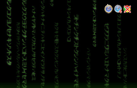
You can try
the actual HTML page and see it working on current WebKit Nightly build or Safari 4.
To display the Katakana characters, I used @font-face rule to embed a Katakana dingbat-like font, rather than using an actual Japanese input.
Although I wanted display the kanakana vertically with using writing-mode: tb-rl, which I believe has been proposed for CSS2, this is not supported on Webkit so I had to use -webkit-transform to rotate each div to 90 degree to display vertically.
This way, each letter faces 90 deg angle too, but oh well, this Japanese letters are random, used only for visual purpose and don’t mean anything so I guess this doesn’t matter for now.
Let’s take a look at some of the CSS3 code, I am showing only important parts so if you would like to view the entire code, just open up the htmlpage and use Webkit’s inspector!
Embed A Katakana Font
@font-face {
  font-family: Katakana;
  src: url('MoonBeams-katakana_.TTF');
}

#matrix{
  font-family: Katakana; /* use the embedded font */
  position: absolute;
  ... (more styles here) ...
}
@font-face rule is not supported by older Safari including iPhone.
On supported browsers, you should be able to use either TrueType (.ttf) or OpenType (.otf).
Define Animations
@-webkit-keyframes fade{
    0%   {opacity: 1;}
    100% {opacity: 0;}
}
@-webkit-keyframes fall{
   	from {top: -250px;}
	to 	{top: 300px;}
}
I used both % and from/to keywords. But with %, you can define in-between state.
Rotate the Katakana Strings
#matrix div{
  position: absolute;
  top: 0;
  -webkit-transform-origin: 0%;
  -webkit-transform: rotate(90deg);
  ...
By setting -webkit-transform-origin as 0%, the div block rotates 90 degrees at the far left.
If you don’t set this, by default, it rotates at center axis.
…and Use the Defined Animations
#matrix div{
  ...
  -webkit-animation-name: fall, fade;
  -webkit-animation-iteration-count: infinite; /* use 0 to infinite */
  -webkit-animation-direction: normal; /* default is normal. use 'alternate' to reverse direction */
  -webkit-animation-timing-function: ease-out;
}
For more detailed info on -webkit-animation properties, read Apple’s Developer Connection
Again, this example is currently working only on the latest WebKit and Safari 4 (not iPhone).
Google Chrome does not support @font-face or animation. (-webkit-transform:rotate... works), and I assume it does not work on Android either.
(And I have no intention to try on other WebKit-base browsers like S60).
comments powered by