Fluid Layout Neue – Responsive Layout with CSS3 Awesomeness
Responsive Web Design has been a hot topic in past years yet I hardly cover in my blog. So here, I am focusing some of the shiny new CSS3 layout modules that are perfectly responsive!
Party like 1999
Back in the time, when kozmo.com delivered you pizza and video, and a sock puppet was advertising pets.com, we developed web sites with complicated layout using <table>. Frameset was an another way to separate navigations from the contents. (OMG! remember the HTML 4.01 Frameset DTD!?). Yes, CSS was there already, but too immature to be used for the web page layout. Craziness.
Early-Noughties: Flipping tables
When CSS was well-standarized in ealry-2000s, “table-less” layout became a job requirement for web developer positions.
(╯°□°)╯︵ ┻━┻
We were excited about the “Holy Grail” column layout, as the same time the Holy Grail gave us such a pain especially when it came to the cross-browser development. About 10 years has passed, and we still somewhat dislike using CSS floats, negative margins and all the hacks to make come columns.
Mid-2000s: Era of UI Libraries
In 2005, around the time when we first heard the word, Ajax, Yahoo! had launched The Yahoo! User Interface Library (YUI). YUI was probably the first UI libraries came with complicated layouts like grids. In 2006, we got jQuery, then jQuery UI later.
With CSS and help with the libraries, we, developers felt more comfortable building modern-looking web sites.
Now and Future: Late for the party with CSS3
As browser vendors have been implementing, we finally started taking advantage of the CSS 3, to create semantic web sites with complex layout with no external libraries. In the era of the responsive web design, these CSS3 fluid layout also can be responsive!
Currently, these CSS 3 layout modules are W3C candidate recommendation, or yet to be determined to be standard.
- Multi-Columns Layout
- lexible Box Layout
- Regions
- Grid Layout
Fluid Columns Example
With CSS3, building the fluid column layout is incredibly easy. CSS3 Multi-column layout modules is currently under Candidate Recommendation, which means it is a stable web standard, and has a good browser support by now although still requires vendor prefixes.
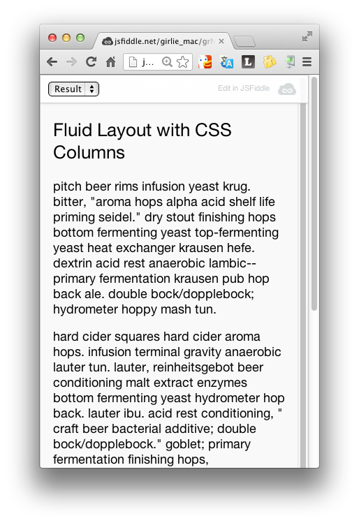 <img src=”http://girliemac.github.io/presentation-slides/html5-mobile-approach/images/column-tablet.png” style=”height:360px;display:inline-block””><img src=”http://girliemac.github.io/presentation-slides/html5-mobile-approach/images/column-desktop.png” style=”height:360px;display:inline-block””>
The actual demo code of the screenshot can be found on my CodePen at http://cdpn.io/LGBgb.
Let’s start from a small screen (Mobile-first, yo!). When the width of the browser windows is pretty small, the page layouts with no multi-column (actually, only 1 column). When the window is wider than 200 x 2 + margin + column-gap (1em but browser dependent) pixels, the content text is displayed in two column, when 200 x 3… and so on and so forth.
The css used for the example is incredibly simple.
.col {
    -webkit-columns: 200px;
    -moz-columns: 200px;
    columns: 200px;
    /* column-count: auto */
}
Flexbox Example
Actually, CSS 3 Flexible Box Layout Module was first introduced in 2009, however, its specifications have been modified over and over since then, and browser vendors have implemented each version. I was a UI developer at Palm back then, and used the flexbox for the core webOS 3 UI design and the framework. I even blogged about the now-outdated flexbox in 2011 for developer.palm.com. It was too early.
Anyway, fast-forward to 2013, Flexbox is now in candidate recommendation, and many browsers even dropped the vendor prefixes.
This demo (http://cdpn.io/CuvBc) uses the latest specs with combination with media-queries to achieve the different layouts. The #main components is displayed in column when the browser window is wide enough, otherwise shown in row.
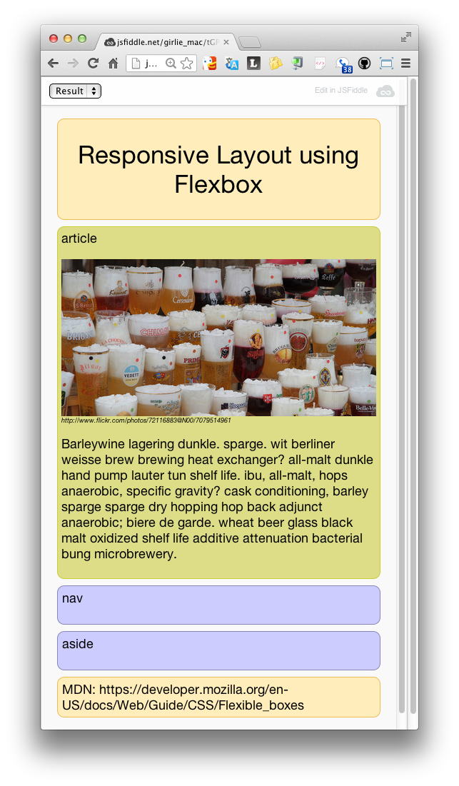
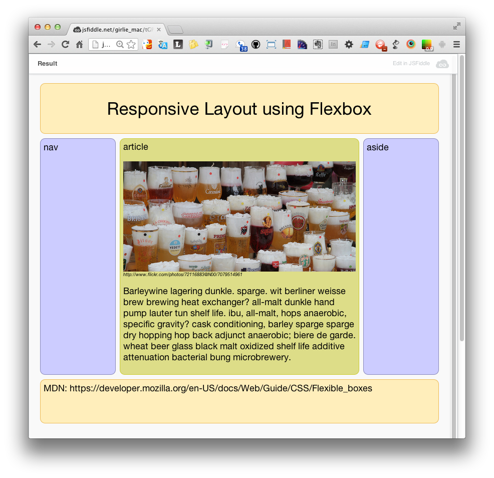
#main {
    display: flex;
    flex-flow: row;
}
...
@media all and (max-width: 640px) {
    #main {
        flex-flow: column;
    }
}
Regions Example
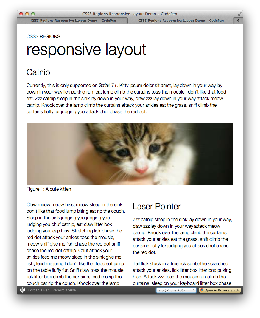
With CSS Regions, you can define how the contents flow, just like magazine layout. CSS Regions Module Level 1 has published as a Working Draft, and it means that the specification is still in very early stage and need to be reviewed. Currently, this is only supported on Safari 6.1+ and iOS Safari 7, also the latest Chrome with the flag enabled. It is probably too early to use for your production in this moment, but I am pretty excited the possibility of more creative web designs. Adobe is leading in this spec and has some excellent demos on their page.
My demo on CodePen (http://cdpn.io/LbAFq) shows the simple magazine-like layout (mix and match with single, and multi-columns with a image) for desktop-sized browser. The complicated layout is definitely not suitable for small screens, so the simplified layout is used for small screens, using media-queries.
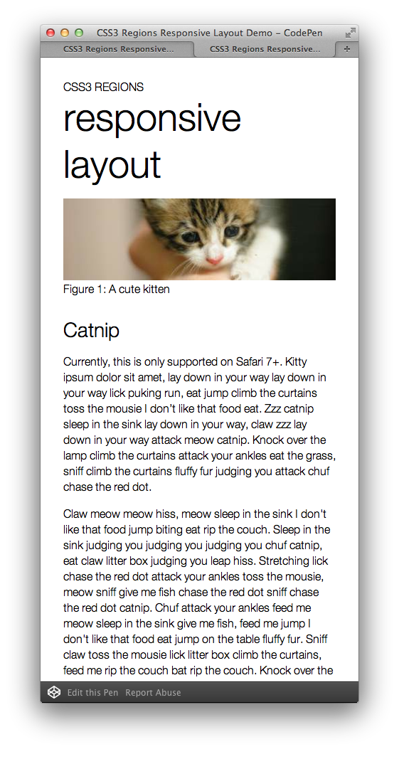
<section class="region region1"></section>
<section class="region region2"></section>
...
<article class="content">content here...</article>
.content {
    flow-into: foo;
}
.region {
    flow-from: foo;
}
@media screen and (max-width: 400px) {
    .content {flow-into: none;}
    .region {display: none;}
}
I omitted the vender prefix in the code sample, however, you do need -webkit prefix for Safari and Chrome for now. As you can see in my code sample, there are a few empty sections, separated from the actual text content in article.
The sections are where the content will be flown into, and the sections can be stylized in any ways you want. To achieve the “regions” layout, you need to:
(1) specify the contents with flow-into property with the value as a name, where you see foo in the code sample. This name of your choice defines the named flow, which the contents will be laid out in the region chain associated with that named flow.
(2) specify the layout region with flow-from property with the same name you just defined (foo in my sample code). It makes the region as a block container, and associates it with a named flow.
To make this layout responsive, cancel the the region layout is defined for the desktop, by giving the value none for the flow-into. Also hide the presentational empty sections with display: none; for the small screen.
By the way, you may have noticed the I use -ms prefix in my Codepen demo, although this demo does not work as expected on IE. The support in IE 10+ is limited to used an iframe as a content source.
Grid Layout
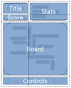
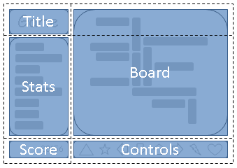
The CSS Grid Layout module is also still in Editor’s Draft status. It defines two-dimensional grid-based layout system. With the module, we will be able to align elements into columns and rows just like tables, but without the content structure that table has.
Actually, I have not created any working samples because the grids specification its going through major changes. It is far from stable and no browsers has implemented the current specs, although IE10+ supports the limited (original) specs.
When supported, we can create responsive grid layout by rearranging grids like this diagrams (from W3C specification page).
 </p>
</p>
Shameless Plug
This article was actually from a part of my talk on the current state and future of the Web standards on Responsive Web development. Besides the fluid layout topic, I covered media-queris, high DPI screens, and responsive images as well. It’s a long talk but if you don’t easily get bored of long talks, you can watch it on YouTube.

Thank you!
References
- CSS Multi-column Layout Module: http://www.w3.org/TR/css3-multicol/
- CSS Flexible Box Layout Module: http://www.w3.org/TR/css3-flexbox/
- CSS Regions Module Level 1: http://www.w3.org/TR/css3-regions/
- CSS Grid Layout Module Level 1: http://dev.w3.org/csswg/css-grid/
- Regions (by Adobe & HTML5): http://html.adobe.com/webplatform/layout/regions/
- Can I Use…: http://caniuse.com/
- Grid Layout (by Internet Explorer Dev Center): http://msdn.microsoft.com/en-us/library/ie/hh673533(v=vs.85).aspx
- ← More Blah Blah on Legacy Clients
- How-to: Migrating Blog from WordPress to Jekyll, and Host on Github →
