Simulating MacOS Dock-like menu with CSS3

Since my original “CSS Aqua button” written last year, I have seen more and more fan CSS3 UI mimic of MacOS components around! I think I have seen some Mac docks too, but as I remember they all use jQuery.
So I was thinking about making one only with CSS.
Initially I thought it was easy – let’s make an hovered icon larger like 200%, and make siblings in 150% of the original size using CSS sibling selector, and done! A piece of cake, huh? – Then I realized I made a mistake. The adjacent-sibling selector apply to an element which is immediately after the element in markup, not both before and after.
Oh well, so I needed to write a minimal JavaScript (so you don’t need to import a whole JS library) to add a class name to the element comes before the hovered object.
Anyway, here’s the live-demo! (Try it with the the latest Webkit Nightly or Safari 4) for the best experience!), and I’ll show you how I did-
Markup (Simplified)
Let’s create menu items as a list.
<div id="dock-container">
  <div id="dock">
  <ul>
    <li><a href="http://android.com"><img src="images/dock-icons/android.png"/></a></li>
    <li><a href="http://palm.com"><img src="images/dock-icons/palm.png"/></a></li>
    <li>...
  </ul>
  <div class="base"></div>
  </div>
</div>
The list should be displayed horizontally by setting the style to #dock li {display:inline-block}. Please see the source code from the demo for the details.
Magnify the icon with CSS transform
 First, let’s define the dock icon animation with css transition.
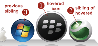
The origin of the transform has to set to bottom, so the icon doesn’t scale from the middle of the icon. (Diagram #1).
I used only a webkit extension for this example but you can use -moz and -o extensions, for Firefox and Opera respectively.
Then, set the hover state – use css transform to scale the icon image up to 200%. Also you need to add some margin otherwise the enlarged icon overlaps with neighboring icons!
#dock li img {
  width: 64px;
  height: 64px;
  -webkit-box-reflect: below 2px
		    -webkit-gradient(linear, left top, left bottom, from(transparent),
		    color-stop(0.7, transparent), to(rgba(255,255,255,.5))); /* reflection is supported by webkit only */
  -webkit-transition: all 0.3s;
  -webkit-transform-origin: 50% 100%;
}
#dock li:hover img {
  -webkit-transform: scale(2);
  margin: 0 2em;
}
Magnify adjacent icons
#dock li:hover + li img,
#dock li.prev img {
  -webkit-transform: scale(1.5);
  margin: 0 1.5em;
}
To magnify the icon at the right hand side of the hovered icon (Diagram #2), all you need to do is define the scale with using a CSS adjacent-sibling selector, E + F (an F element immediately preceded by an E element).
For the icon at the left (Diagram #3), ss I mentioned earlier, there is no css to get the previous sibling, so I need to rely on JavaScript.
I used the DOM node interface, previousElementSibling to access the sibling node. previousElementSibling should be supported by Webkit, Opera and Firefox.
Basically what I am doing here is that get the mouseovered object (should be an img element), find the parent li element (the immediate parent should be an a-alement, not a li, so get a’s parent! Check the HTML code again!), find the previous sibling li, then give a classname “prev” so I can apply the style.
Don’t forget to remove the class name as mouseout, otherwise the icon stays large.
function addPrevClass (e) {
  var target = e.target;
    if(target.getAttribute('src')) { // check if it is img
      var li = target.parentNode.parentNode;
      var prevLi = li.previousElementSibling;
      if(prevLi) {
        prevLi.className = 'prev';
      }

      target.addEventListener('mouseout', function() {
        prevLi.removeAttribute('class');
      }, false);
  }
}
if (window.addEventListener) {
  document.getElementById("dock").addEventListener('mouseover', addPrevClass, false);
}
For more details with the fancy CSS3 effects (e.g. the gradient and 3D-transform to create the “base” of the dock), please see the source code of the demo page!
comments powered by
