Making Chupa-Chups using CSS3 Pseudo-elements
One of the biggest reasons why I don’t blog often is probably because I tweet a lot. Just write a few words and throw some jsfiddle or Dabblet URLs in 140 chars, and boom, I can reach sizable numbers of people. It was quick and easy for me when I had busy days…
Well, now, I have lost my job at Hewlett-Packard (as they ditched Palm hardware then dumped the webOS software as open-source, they no longer need me and my hard-working teammates), so I should no longer excuse for not writing. So here I am, I decide to write up about CSS3 shapes from the fiddles I have written recently:
Shapes with CSS3 Part.1 – Heart

Heart-shaped chocolate live demo: http://codepen.io/girliemac/pen/xkiDz
This Valentine’s Day demo (I really did make this on Feb.14!) shows how to create a heart shape.
Basic idea behind is that creating two rectangles with round-corners on top-left and top-right, and rotate each object in either positive or negative 45 degrees. The trick of making two objects in one HTML element is using pseudo-elements, ::before and ::after.
This code snipet shows how to create a simple heart-shape:
.heart {
	position: relative;
}
.heart::before,
.heart::after {
	content: "";
	position: absolute;
	top: 0;
	background-color: red;
	width: 150px;
	height: 240px;
	border-radius: 75px 75px 0 0;
}
.heart::before {
	left: 0px;
	transform: rotate(-45deg);
	background-color: red;
}
.heart::after {
	left: 64px;
	transform: rotate(45deg);
}
In this example, I omit the vender prefix, but you do need to include them, for example, -webkit-transform to be able to make this code work on the current browsers.
Shapes with CSS3 Part.2 – Flower

Chupa-Chupsy live demo: http://codepen.io/girliemac/pen/gnfwd
This Chupa-Chups, or I’d call it Chupa-Chupsy candy, since I cannot replicate the actual design of the candy wrapper accurately. (Oh, by the way, did you know the logo was created by the surreal artist, Salvador Dalí? Seriously.)
So I tried to mimic the signature yellow flower-shape, with one HTML element using the pseudo-element. This shape is made with a combination of two rounded-corner squares. One of the square is rotated to 45 degrees.
This is how to create the basic flower-shape:
.flower-shape {
    position: relative;
}
.flower-shape,
.flower-shape::before {
    width: 200px;
    height: 200px;
    border-radius: 25%;
    background: yellow;
}
.flower-shape::before {
    content: "";
    position: absolute;
    transform: rotate(45deg);
}
In this example, I used only ::before pseudo-element, instead of both before and after. Although I used both for the heart-shape example (which is made with two rectangles), technically, you can include three objects into one HTML element by inserting each object before and after the object on the element.
So if you’d like to have a flower with 12 petals, you can define .flower-shape::after, which is rotated in 30deg. Make sure to make the .flower-shape::before in -30deg.
To mimic the candy logo, I used the most similar web-font I found on Google Web Font. Once you see the real Chupa-Chups logo, you’ll see this web-font is actually nothing resembling it. But, hey.
Shapes with CSS3 Part.3 – Speech Bubble

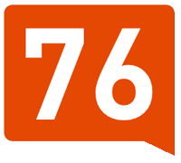
Klout Score Flag demo: http://jsfiddle.net/girlie_mac/2uk6U/
This is a no-image replica of the Klout score flag! Creating this speech-bubble style shape used the same technique using ::after pseudo-element.
The method of making the triangle shape is the good’ol CSS2 border shading trick using border-width and border-color. Giving think borders around a box with zero width and height. The triangle size is determined by the border-width, with the given color on the one side and transparent on the rest of the sides. You can read more about how to create a triangle on CSS-Tricks.
The basic shape can be coded like this:
.speech {
    background-color: orange;
    width: 200px;
    height: 160px;
    border-radius: 10px;
    position: relative;
}
.speech:after {
    content: "";
    display: block;
    width: 0;
    height: 0;
    border-bottom: 28px solid transparent;
    border-right: 58px solid orange;
    position: absolute;
    right: 0;
}
comments powered by
