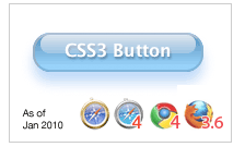
CSS3 Aqua Button – Revisited for Firefox 3.6
This is an update for the Aqua button tutorial. This update will add a support for Firefox 3.6. If you haven’t seen the article, please go read it before proceeding here.
On the end of November last year, Mozilla Hacks announced the support for CSS gradient in a background on upcoming Firefox 3.6 (which final version has just released recently).
As already been supported on WebKit, FF does support both linear and radial gradient, however, Mozilla has implemented differently –
Most noticeably, Mozilla separate linear and radial gradient as -moz-linear-gradient and -moz-radial-gradient, while on WebKit, the syntax goes -webkit-gradient and you specify linear or radial.
Also the specification of each value is different too.
If you want a linear gradient starting from red on top to ending at bottom in white, you need to define –
WebKit:
background: -webkit-gradient(linear, left top, right bottom, from(red), to(white)))
Firefox:
background: -moz-linear-gradient(top, red, white);<br />
The Aqua Button Redefined
Let’s re-create the aqua button, by adding -moz prefixed gradient definitions:
The button:
.aqua{
  background-color: rgba(60, 132, 198, 0.8);
  border-top-color: #8ba2c1;
  border-right-color: #5890bf;
  border-bottom-color: #4f93ca;
  border-left-color: #768fa5;
  -webkit-box-shadow: rgba(66, 140, 240, 0.5) 0px 10px 16px;
  -moz-box-shadow: rgba(66, 140, 240, 0.5) 0px 10px 16px;
  background-image: -webkit-gradient(linear, 0% 0%, 0% 90%, from(rgba(28, 91, 155, 0.8)), to(rgba(108, 191, 255, .9)));
/* for FF 3.6 */
  background-image: -moz-linear-gradient(rgba(28, 91, 155, 0.8) 0%, rgba(108, 191, 255, .9) 90%);
}
and the glare:
.button .glare {
  position: absolute;
  top: 0;
  left: 5px;
  -webkit-border-radius: 8px;
  -moz-border-radius: 8px;
  height: 1px;
  width: 142px;
  padding: 8px 0;
  background-color: rgba(255, 255, 255, 0.25);
  background-image: -webkit-gradient(linear, 0% 0%, 0% 95%, from(rgba(255, 255, 255, 0.7)), to(rgba(255, 255, 255, 0)));
  /* for FF 3.6 */
  background-image: -moz-linear-gradient(rgba(255, 255, 255, 0.7) 0%, rgba(255, 255, 255, 0) 95%);
}
This is the actual html page. Open it on Firefox 3.6 and see!
More Info on Mozilla CSS Gradients
- CSS gradients in Firefox 3.6 by HACKS.MOZILLA.ORG
- -moz-linear-gradient by Mozilla Developer Center
- -moz-radial-gradient by Mozilla Developer Center
- ← I Can Has iPhone App on App Store
- CSS3 Box-Shadow with Inset Values – The Aqua Button ReReVisited! →

