Responsive Web Made Easier with Chrome DevTools Device Mode
Note: I originally wrote this article for HTML5Experts.jp in Japanese, as a part of their Google I/O special editions. This blog post is more of the abridged version of my original article, which uses more actual quotes (translated) from Google I/O.
Device Mode
Last month at Google I/O, Paul Bakaus introduced a set of brand-new (still experimental) tools, called Device Mode for Chrome DevTools. Currently, this feature is only available on Chrome Canary (v38 and newer).
The Device Mode comes with presets of device information including screen width, height, and device pixel ratio from popular devices, like Nexus 5 and Samsung Galaxy series, and makes responsively designed web development easy for us.
Media-Queries Tool
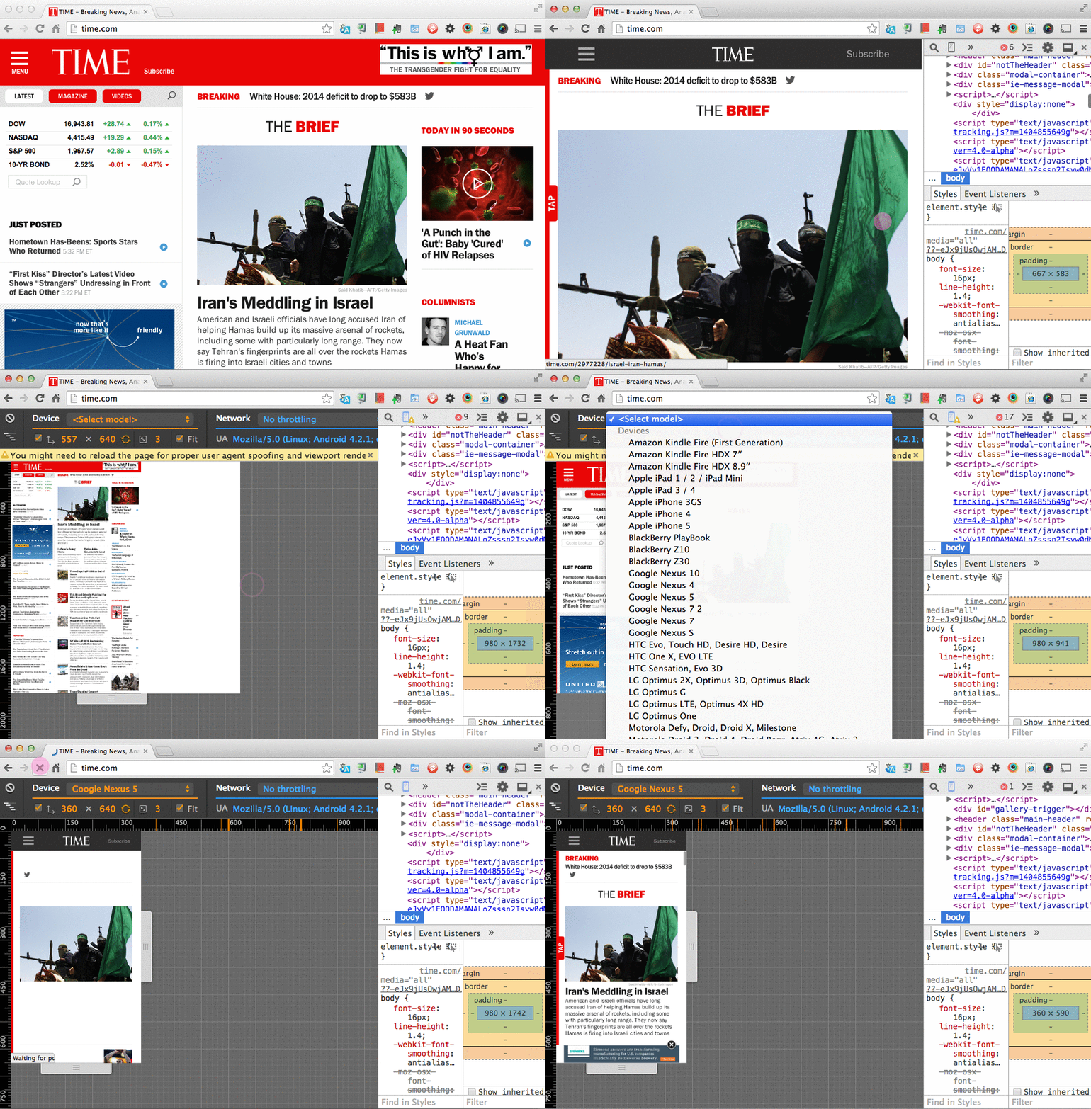
Once you open DevTools in Chrome Canary, you see a little device icon on left in tab bar at the top. By clicking the icon, the regular webpage display pane becomes the device mode. Here you can resize the window along the ruler UI, or choose one of the devices from a dropdown menu. If you choose a device with a large resolution, you can make the screen shrinks to fit in the display pane too. Also, switching its orientaion by swapping the width and height values by clicking the toggle icon.
What I found more useful in this Device Mode is the Media-queries tool. Clicking the icon at the left side of the device presets (the one looks like steps), you get the visual representations of the media-queries used for the page. Select one of these bars from the UI and right-click it gives you a select menu that says “Reveal In Source Code”, so mouseover it to view all CSS file paths. Click a file to inspect the source code!
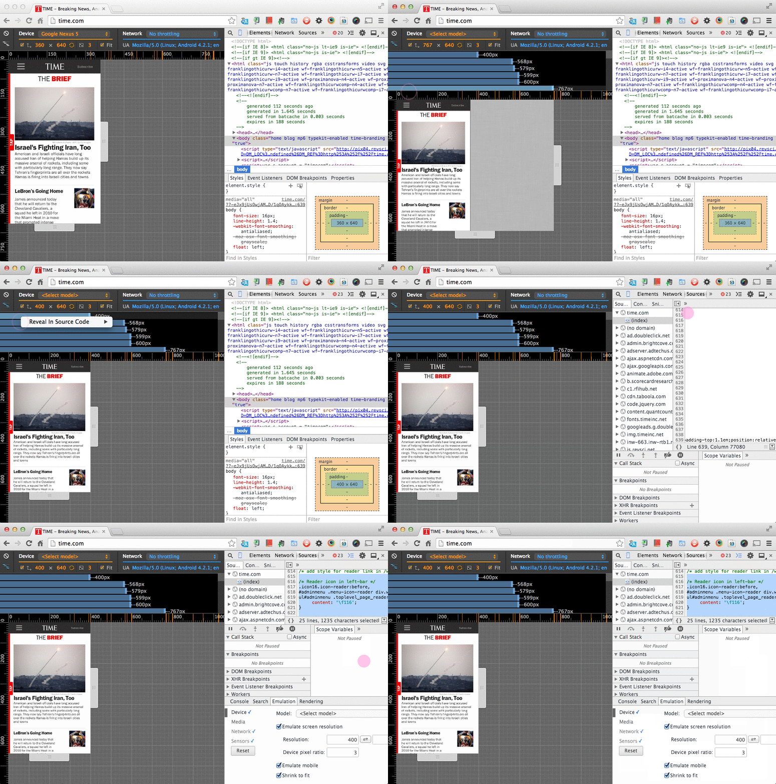
Apparently, with another new feature called Workspace, you can edit the media-queries on DevTools directly, and the changes reflect to the local file systems on the fly.
Connectivity
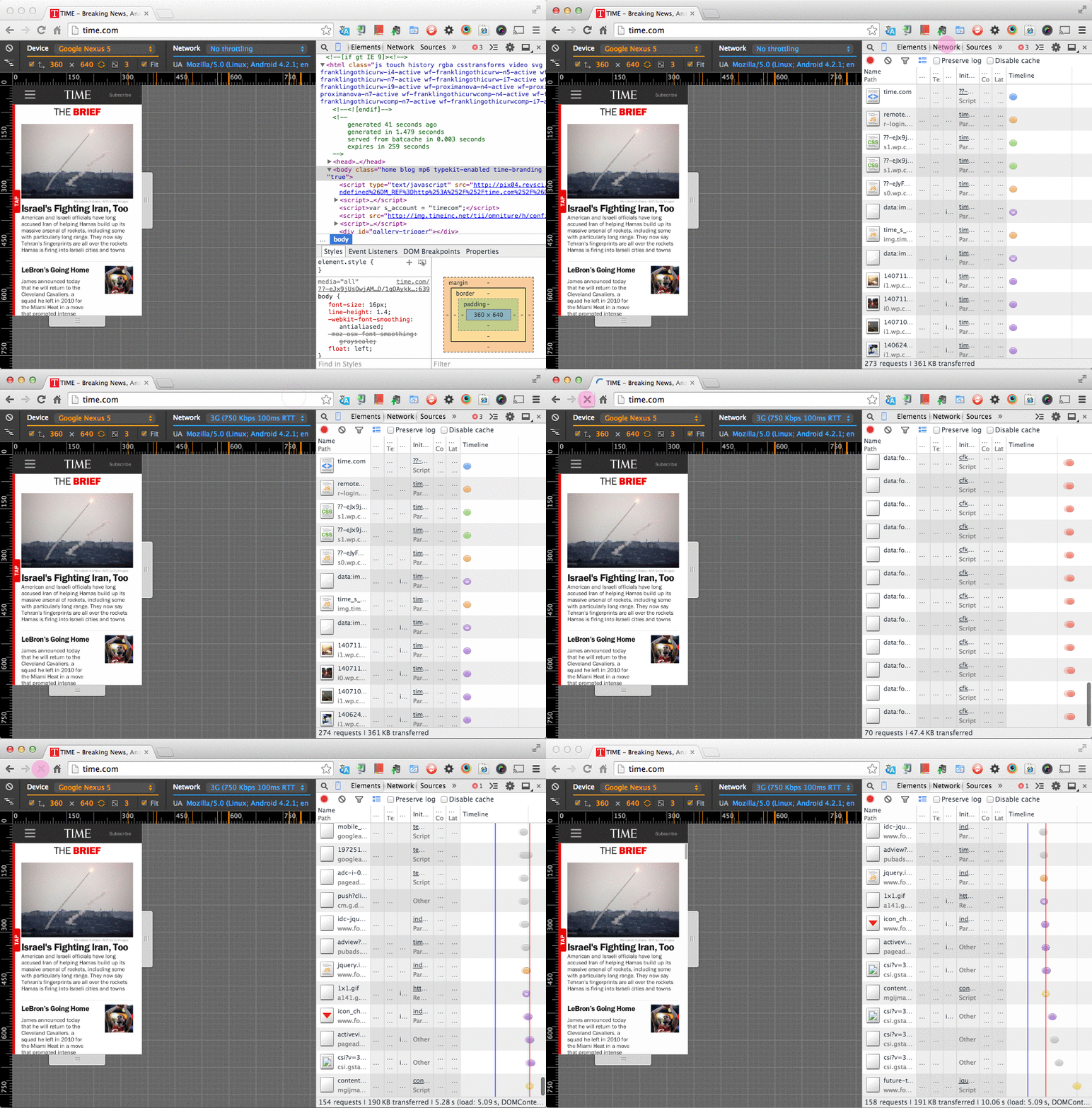
The new tool comes with the network emulation presets as well. From the dropdown next to the device menu, you can pick mobile networks like 3G and EDGE to emulate the connectivity, and make performance testing easier.
Remote Debugging with Screencast
There is a newer addition to the Device Mode- a better screencasting feature. This obscure feature has been intruduced to Chrome DevTools already a while ago, but the new and improved features just landed to Canary as an experimental tool. This new screencast comes with Canary build 38.0.2101.0 and newer.
To use the experimental features, you need to enable the DevTools Experiments from chrome://flags/#enable-devtools-experiments. Then open the DevTools and click the gear icon to manually turn on the screencast feature.
Also, you need to enable USB Debug mode on your Android device.
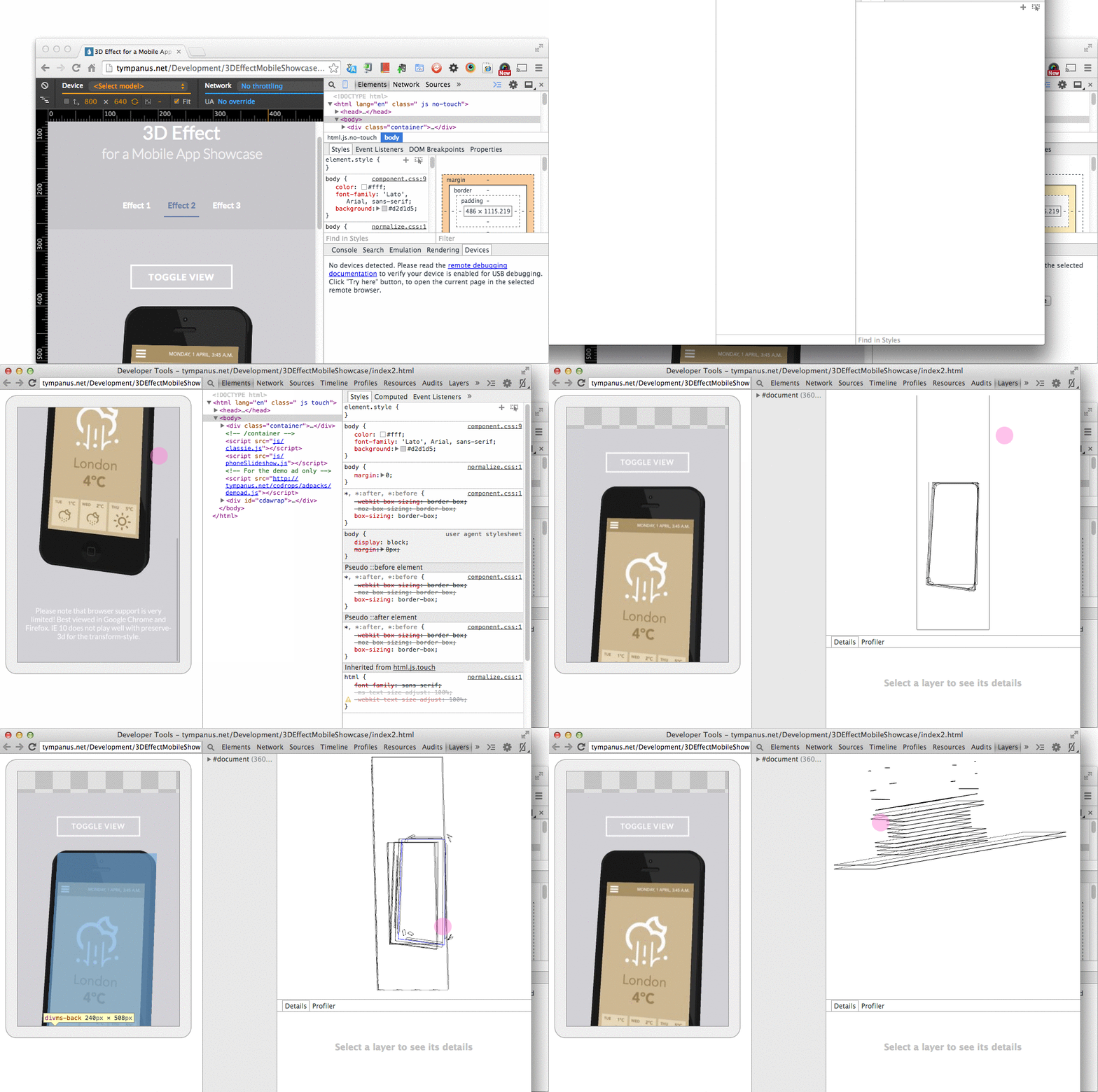
Once you connect a deivice to your desktop with a USB cable, you should see an little device icon with “1”, which indicates the number of devices connected. Then click “Try Here” button to open a screencast window.
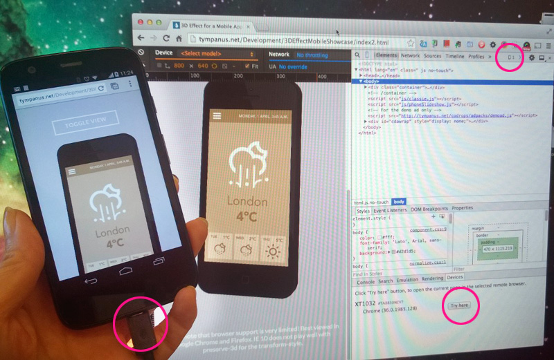
Typing a URL onto the DevTools reflects on your device. Your device should launch the web page on Chrome. And you should be able to navigate the page from both device and the screencast. Clicking “Layers” tab gives you a visualized DOM layers to measure rendering and painting. You can pinpoint where painting jankiness occurs with another new feature, Paint Profiler too!
Takeaways
Here is a list of the DevTools new features for mobile development:
Responsive Layouts
- Rich reprresentsation of media-queries
- Style filtering
- Media-queries editting
- Inline emulation
Rich Emulaton
- Device presets for most popular devices
- Rich viewport emulation
- Sensor emulation (touch, geolocation, accelerometer)
- Network throttling and offline
Remote Debugging
- Plug and play
- Existing but more powerful features
- Screencast
- Port forwarding
I am pretty exited with the cool new features, and hoping it to be more polished to make available for the stable Chrome release soon. Keep up the great work, Chrome team!
comments powered by
