Resolution in Media Queries

I realized I hardly blog about mobile web development, although I do tweet about mobile quite often! (If you have not follow me on twitter, follow @girlie_mac now.)
So I decided to post a few short topics from my last presentation, and my first topic off the preso is about CSS resolution.
CSS Resolution
This is such obscure CSS 2 feature that not many people know or have used.
The resolution media feature describes the resolution of the output device, and its unit can be-
- dpi (dots per inch)
- dpcm (dots per centimeter), and
- dppx (dots per pixel, proposed for CSS3)
Why it matters?
So why has this become relavent to mobile web development now?
Because mobile display has been up-res’ing since Apple has announced the Retina display. To be honest with you, I am not sure if other manufacturers like Samsung had high pixel density displays before Apple, however, the hi-res trend has started ever since.
Retina display has the twice as much pixel density, and its device pixel ratio is 2 (DOM window.devicePixelRatio == 2), and for example, Nexus One has 1.5.
I am not talking more details on pixel density here, however, if you would like to learn more about what “device pixels” means and how a CSS pixel differs from a device pixel, I recommend PPK’s article, “A pixel is not a pixel is not a pixel“.
Crazy vender differences on device-pixel-ratio
In Webkit, the media query to differentiate the “regular” display (where a CSS pixel equals to a device pixel) versus the high pixel density displays, device-pixel-ratio is commonly used. To be precise, you must add the webkit prefix (as of August 2012), as -webkit-min-device-pixel-ratio, to check the minimum value of 2, 1.5, etc.
So what about non-Webkit?
Well, this gets more complicated than you think- For Mozilla, prefixed min-device-pixel-ratio is min--moz-device-pixel-ratio, and for Opera, the prefix rule is similar to webkit, -o-min-device-pixel-ratio, however, Opera requires the device pixel ratio value as a fraction, as 2/1 and 3/2 (instead of 2 and 1.5, respectively).
This is too annoying, right?
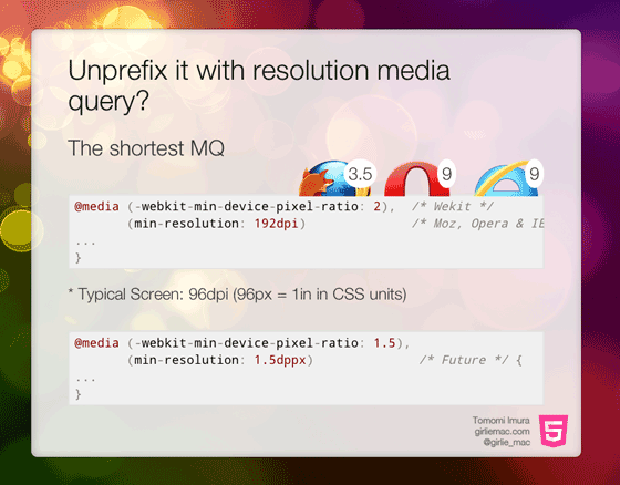
Unprefix it with resolution
So here’s a solution – use resolution.
Instead of writing,
@media only screen and (-webkit-min-device-pixel-ratio: 1.5),
       only screen and (min--moz-device-pixel-ratio: 1.5),
       only screen and (-o-min-device-pixel-ratio: 3/2)
       only screen and (min-device-pixel-ratio: 1.5) {
    // some hi-res css
}
Write this:
@media only screen and (-webkit-min-device-pixel-ratio: 1.5),
       only screen and (min-resolution: 144dpi) {
    // some hi-res css
}
On current mobile browsers, this shorter media-queries work on Webkits (Safari, Chrome, Android, MeeGo/Nokia, Dolphin etc.) and Firefox, Opera and IE9+! (Edit: IE9 and IE10 do support the resolution, however, it may recognize its value wrongly. e.g. Lumia 800 has the screen resolution of 480×800, while CSS pixel width of 320px, but the CSS resolution value is recognized as 96dpi, instead of 144dpi. Updated on Aug 23, 2012: According to Microsoft’s IE team, IE Mobile’s layout is done at 96dpi independently of the device so the dpi value not reflect the actual device.)
In case you wonder where the number 144 comes from – this is 1.5x of the regular screen resolution, 96dpi. If you want to detect Retina (Galaxy Nexus, or any displays with 2x pixel density), you use 192dpi.
Once the proposed unit, dppx is supported (no browsers support in this moment), this would be simpler like:
@media only screen and (min-resolution: 1.5dppx) {
    // some hi-res css
}
So stop worrying about the confusing device-pixel-ratio. Life shouldn’t be more complicated!
References
comments powered by
