
Webkit CSS 3D + Local DB Demo
Ever since I heard of Snow Loepard’s hardware-accelerated CSS, I wanted try some cool CSS animation for Safari 4.
So after installing Snow Leopard, I spent about a day and half to try creating my first 3D animation with Flickr API.
Honestly, I wasn’t sure where to get started to make some cool 3D effect, so what I did was I tried to reproduce the one on webkit.org example and modify a lot by trial and error approach.
Also, I have been freqently asked about how I did with “My Favorites” feature on my Palm Pre app (which is also a WebKit-based), so I throw the HTML5′s local storage demo with this 3D demo.
So here, you can try my CSS 3D and Local DB Demo!!!
Be sure to view this demo on Safari 4, iPhone Safari, or WebKit Nightly! This doesn;t seem to work on other Webkit-based browsers such as Chrome and Palm.
I am not going to write a whole tutorial how to replicate this animation but I try to explain some examples.
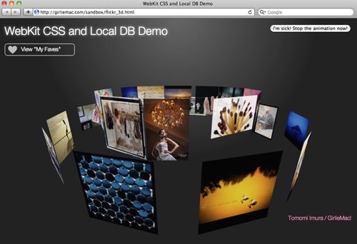
Spin a Wheel!
Look at one of the flicke photo wheel on my demo. This is a combination of a few different animation.
Let’s focus on the small wheel inside. This is the snippet of HTML of the wheel:
<div id="gallery">
  <div id="pic01"><img src="..."/></div>
  <div id="pic02"><img src="..."/></div>
  ... (10 more imgs)
</div>
OK, for now, let’s ignore how each photo is rendered to form a loop, and just focus on the animation of one div, #gallery (= a wheel). A band of photos is ratating clockwise around Y-axis.
This means the animation starts as -webkit-transform: rotateY(0); and goes around an circle for a whole 360 degree. ` -webkit-transform: rotateY(-360deg);`.
Use positive if you want to rotate in opposite direction.
I set the whole circle completion span as 60 seconds in linier motion and the animation goes infinite.
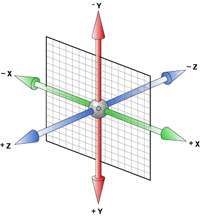
This diagram from Apple’s Safari Reference Library explains coordinates.
So the css for this movement is defined as:
#gallery {
  -webkit-transform-style: preserve-3d;
  -webkit-animation: spinY 60s linear infinite;
}
@-webkit-keyframes spinY {
  from { -webkit-transform: rotateY(0);}
  to   { -webkit-transform: rotateY(-360deg);}
}
Use 3D style, -webkit-transform-style: preserve-3d;to give 3D illusion. I set the initial perspective in its parent div as -webkit-perspective: 380;.
It gives you an illusion of the depth. You can make the value lower to make it look more up-close to you.
The unit of perspective should be “px”, but it looks like you’d better remove it for iPhone.


To figure out how to render each photo in loop, also other animations, please look at the source code of my demo.
Also, I will write about how to use HTML 5′s local storage sometimes later!
References
- 3D Transforms by Webkit.org
- CSS Transforms (2D) by Webkit.org
- CSS Animation by Webkit.org
- CSS 3D Transforms Module Level 3 W3C Working Draft
- Safari Reference Library -Transforms by Apple
comments powered by