23
2009
WebKit Comparison on CSS3
Bitstream has launched a new mobile browser called Bolt, which is a J2ME browser and use WebKit as a rendering engine.
Instead of writing a review on this new WebKit browser, I decided to just do some quick CSS3 test on variety of WebKit browsers!
If you rather read the review, I recommend WAP Review. There’s a very detailed great article on Bolt there.
WebKit browsers I used
- WebKit Nightly for Mac OS X (as a Control)
Mozilla/5.0 (Macintosh; U; Intel Mac OS X 10_5_4; en-us) AppleWebKit/528.11+ (KHTML, like Gecko) Version/4.0dp1 Safari/526.11.2 - iPhone Safari
Mozilla/5.0 (iPhone; U; CPU iPhone OS 2_2 like Mac OS X; en-us) AppleWebKit/525.18.1 (KHTML, like Gecko) Version/3.1.1 Mobile/5G77 Safari/525.20 - Chrome by Google
Mozilla/5.0 (Windows; U; Windows NT 5.1; en-US) AppleWebKit/525.19 (KHTML, like Gecko) Chrome/1.0.154.43 Safari/525.19 - HTC Dream Android
Mozilla/5.0 (Linux; U; Android 1.0; en-us; dream) AppleWebKit/525.10+ (KHTML, like Gecko) Version/3.0.4 Mobile Safari/523.12.2 - Nokia N95 8GB
Mozilla/5.0 (SymbianOS/9.2 U; Series60/3.1 NokiaN95_8GB/10.0.021; Profile/MIDP-2.0 Configuration/CLDC-1.1 ) AppleWebKit/413 (KHTML, like Gecko) Safari/413 - Bolt 0.74 on Nokia N95 8GB
Mozilla/5.0 (X11; 78; CentOS; US-en) AppleWebKit/527+ (KHTML, like Gecko) Bolt/0.741 Version/3.0 Safari/523.15
CSS3 Styling I tested
.opracity {opacity: .5;}
.textShadow {text-shadow: #777 2px 2px 2px;}
.textShadows2 {text-shadow: rgba(0,0,255, .7) 3px 3px 2px, rgba(255,0,0, .7) -3px -3px 2px;
.ellipsis{text-overflow: ellipsis; width: 200px; overflow: hidden;}
.borderRadius {background-color: #666; color: #fff; width: 200px; padding: 10px; -webkit-border-radius: 10px;}
.boxShodow{-webkit-box-shadow: #000 3px 2px 6px; width: 200px; padding:5px;}
.strokeAndFill{-webkit-text-stroke: 1px green; -webkit-text-fill-color: #ccc; font-size: 2em; }
.borderImg{-webkit-border-image: url(button.gif) 0 13 0 13 stretch stretch; border-width: 0px 13px; padding: 5px 0 7px;}
Results
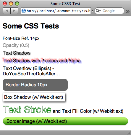
WebKit Nightly – This is how everything should look like.
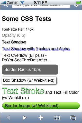
iPhone Safari

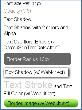
Chrome and Android Browser


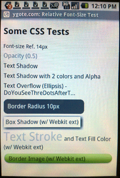
Nokia “Web” and Bolt on N95 8GB

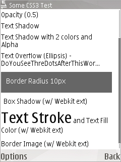
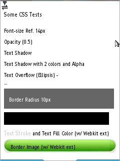
* note: Android’s actual screen res is 320×480. The screenshot is not an actual size. (Obviously this is a photograph!). Also the screenshot for iPhone is from emulator but I tested on an actual device as well.
Summary
| Properties | WebKit Ntly | iPhone | Chrome | Android | Nokia | Bolt |
|---|---|---|---|---|---|---|
| opacity | Y | Y | Y | Y | N | N |
| text-shodow | Y | Y* | N | N | N | N |
| text-overflow (ellipsis) | Y | Y | Y | Y | Y | N** |
| border-radius | Y | Y | Y | Y | N | N |
| -webkit-box-shodow | Y | Y | Y | Y | N | N** |
| -webkit-text-stroke | Y | Y | N | N | N | N |
| -webkit-text-fill | Y | Y | Y | Y | N | Y |
| -webkit-border-image | Y | Y | Y | Y | N | Y |
* Basic feature is spported, but not multiple shodows.
** Not degraded gracefully. Contents become unreadable so should be avoided.
Additional Notes
Besides the CSS3 test, it is noticeable that Bolt does not honer css font size, weight and header with H tag. This is happening to another J2ME browser, Opera Mini 4 (not tested here since Opera Mini is not WebKit-based). Additionally, like Opera Mini, Bolt uses proxy for rendering and compression. Data is passed through proxy before sending to device.
7 Comments to “WebKit Comparison on CSS3”
Leave a comment
Recent Posts
- Touchy-Feely with DOM Events: Rethinking Cross-Device User Interaction
- My Mobile HTML5 Talks Slides
- How to Enable WP8 Emulator on Mac
- HTML5 Form Validation のカスタマイズ
- HTML5 Dev Conf Slides
- HTML5 File API & XHR2 with Node.js Express
- Because I Want Mobile Web to Be A Better Platform
- Resolution in Media Queries
- HTML5: The Mobile Approach
- Creating Non-disruptive Notifications with HTML5
- Making Chupa-Chups using CSS3 Pseudo-elements
- Quick Fun: CSS3 Filter Effects
- The Day I seized The InterWeb – HTTP Status Cats
- HTML5 Form Field Validation with CSS3
- HTML5 Input Event Handlers and User-Experience
- Creating Usable Enyo UI – Buttons and Interactive Dialogs
- Thank you, Steve!
- Five CSS tricks used in Enyo JS Framework, and you can try them too!
- Open Web Camp III
- Quick Demo: CSS3 Fancy Avatar


Hey,
I have been working with webkit transform and moz tranform recently…Sorry for bothering but i dunno where else to ask it..
I have been tryin to scale up a google gadget before displaying it on my page. It works fine in Firefox but the buttons on the gadget dont seem to work in Safari..can you please help…(this has been the case with all gadgets i have tried so far)
code:
.gadgetdiv{
-webkit-transform-origin:top left;
-webkit-transform:scale(1.5);
-moz-transform-origin:top left;
-moz-transform:scale(1.5);”
}
Hi Rahul.
It is actually a timely topic since Firefox has released Firefox 3.1 (Shiretoko) that supports a bunch of css3 properties!
I tested the code with:
1) an image
2) iframe
3) script src (embedded Google Gadget)
On Firefox 3.1b on Mac, all works beautifully.
On WebKit and Safari, I found (2) and (3) transform as expected (scale to 1.5x), however, both fails to load the content on WebKit Nightly, and (2) failed to load and (3) content is loaded partially on Safari 4.
So I’d say, it is a limitation/bug on Safari?
Hmmm…thanks for the response..
Thats rather strange considering webkit CSS transforms have been around longer…
Also, I have noticed in some gadgets that the buttons and links work where they should have been if scaling wasn’t done…so i would say thats definitely a bug…
Hi! I’m adapting mobile web contents specifically for iphone so i was trying out some of these fun stuff. But I think that iphone’s safari does not support both webkit’s reflect and gradient effects. Do you know if this is true? I tested the gradient with this link:
http://www.martinilab.com/blog/wp-content/uploads/2009/05/album.html
I tested the reflect effect some time ago… Can you share your expertise?
Thanks in advance!
Luis
Hi Luis! I think you’re right. So far, it looks like neither gradient or reflect (also many more css3 fun stuff) seem to be supported by mobile Safari. Nothing I wrote had worked on my iPhone.
I am hoping the next gen will!
Tomomi,
Dave here from WKB and jQTouch. I’ve been searching for something like this, but a tad more comprehensive, for a while now. I’m not able to find what I’m looking for, so I was wondering if I could possibly “sponsor” your research a bit more — I could, for example, send you some cash via PayPal, in exchange for you appending results to this… We could even present as a joint venture between WKB and GirlieMac — I’ll gladly help design the results
I could see it becoming somewhat authoritative, ala http://www.campaignmonitor.com/css/. Would this be something you’d be interested in?
Primarily, I would want to add several devices/systems, like separating iPhone 2.2 vs. iPhone 3.0 (or 3.1 soon enough…), the Pre, and Android’s first release vs. the “cupcake” update. I would also want to add in a variety of tests like transitions, animations, gradients, tap-highlight-color, rgba, reflections, etc. Ideally, we could also add some HTML/Javascript tests, like localStorage, Cache Manifest, transition events, and touch events.
Anyway, you get the idea. Let me know if you’re interested. We could even throw it on a mini-site like “webkitreport.com” — would be a great promo for both of us. Anyway, hope all’s well, email me
[...] iPhone’s Safari already supports client-side storage and CSS3. [...]