
WebKit CSS Animation Examples
According to WebKit.org, the WebKit supports the simplest kind of animation called a transition.
Transitions are specified using the following properties:
- transition-property – What property should animate, e.g., opacity.
- transition-duration – How long the transition should last.
- transition-timing-function – The timing function for the transition (e.g., linear vs. ease-in vs. a custom cubic bezier function).
- transition – A shorthand for all three properties.
Last week, I’ve noticed that Apple had published some new documentations at Developer Connection, including
Safari CSS Animation Guide for iPhone OS and Safari CSS Transforms Guide for iPhone OS (Go to download page).
Since I read the WebKit.org blog entry last year, I was interested in the CSS animation so I finally decided to give it try.
I spent some time writing several CSS tests, ran on several different WebKit browsers. and my conclusion is that:
- the animation and transforms are pretty buggy on current iPhone Safari.
- the current WebKit nightly (as of July 19) has some bugs so animation doesn’t work when swapping class names
with oncick event handler attributes like, using
this.className='newClassName'. </ol> The className swap was working perfectly, until I installed the newer build, r35231.
I will file the bug to Webit.org soon.
On latest build, build r35075 – r35231 (the newest one I tested),
changing the values of style object properties, instead, as
onclick="this.style.opacity='0'"
I wanted to create the animation entirely absent of JavaScript, but now I need to use a function to handle multiple style properties…
UPDATE / CORRECTION (July 23, 08) – please see “More Update on CSS Animation”
I still haven’t gotten a chance to try iPhone 3G yet, and I tested only on my old iPhone with the latest upgrade.
Are there any differences in between two Safaris? I doubt it.
Anyway, Open the test page I wrote in a new window!
Animate Opacity
Expected result: When a user mouse-overs the box, an object appears smoothly (opacity=.5) in 2 sec.
On mouse-click, the image fades in completely (opacity=1).
.box1 img{
	opacity: 0;
	-webkit-transition: opacity 2s ease-out;   /* shorthand for all three properties */
}
.box1 img:hover {
	opacity: .8;
}
<div class="box1">
	<img src="images/apple.png"/>
</div>
Animate Position – Move to right
Expected result: the image moves to the right as fading out.
.box2{
	opacity: 1;
  	-webkit-transition-property: opacity, left;
	-webkit-transition-duration: 1s, 1.5s;
	transition-timing-function: ease-in;
}
<div class="box2" onclick="this.style.opacity='0'; this.style.position='relative'; this.style.left='500px'">
	<img src="images/apple.png"/>
</div>
Animate Letters – Letter-Spacing
Expected result: When the text is clicked, each letter spaces out as fading away.
It is pretty cumbersome to handle multiple style properties with onclick, so I added a JavaScript function to take care:
function switchStyles(style,obj) {
	for(var prop in obj)
		style[prop] = obj[prop];
}
.box3{
	color: green;
	opacity: 1;
  	-webkit-transition-property: opacity, letter-spacing;
	-webkit-transition-duration: 1.5s, 2s;
	transition-timing-function: ease-out, linear;
}
<div class="box3"
     onclick="switchStyles(this.style,{
	    color : 'lime',
	    opacity : '0',
	    letterSpacing : '3em'
});">
	some text to be clicked here.
</div>
Transform – Click to spin the image and fade away
Expected result: the image rotates twice (360 deg x 2) around the Z axis, as fading.
.box4{
  	-webkit-transition-property: -webkit-transform, opacity;
	-webkit-transition-duration: 2s;
	transition-timing-function: cubic-bezier(0.42, 0, 0.58, 1.0); /* equivalent to ease-in-out */
}
<div class="box4"
	 onclick="switchStyles(this.style,{
	    webkitTransform: 'rotate(720deg) translate(1000px,0px)',
		opacity: '0'
});">
	<img src="images/apple.png"/>
</div>
Also, I tried CSS gradients. These still don’t seem to work on iPhone but worked on all recent WebKit nightly.
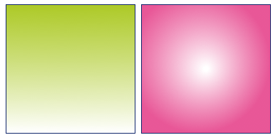
CSS Gradients – Linear and Radial
Expected results:
Linear – Green to white top-to-bottom linear gradient
Radial – White to pink center-to-outer radial gradient
Actual results:
Nicely working on WbKit nightly builds. Failed miserably on both Mac desktop and iPhone Safari 3.1.
Screenshot of the results on WebKit nightly
The syntax is as follows:
-webkit-gradient(<type>, <point> [, <radius>]?, <point> [, <radius>]? [, <stop>]*)
#gradientLinear{
	float: left;
	width: 180px;
	height: 180px;
	border: 1px solid #11276c;
	background:
		-webkit-gradient(linear, left top, left bottom, from(rgba(158,192,0,.85)), color-stop(1, #fff));
}

#gradientRadial{
	float: left;
	margin-left: .5em;
	width: 180px;
	height: 180px;
	border: 1px solid #11276c;
	background:
		-webkit-gradient(radial, center center, 3, 80 80, 100, from(rgb(255,255,255)), to(rgba(228,56,132,.85)), color-stop(0%,#fff));
}
Resources:
- Surfin’ Safari – CSS Animation
- Surfin’ Safari – Introducing CSS Gradients
- Safari CSS Animation Guide for iPhone OS
- Safari CSS Transform Guide for iPhone OS
comments powered by